Pearson's Crystal Data Features: Dynamic plots
Features overview
Previous: All views at a glance
Next: Figure plots
You can create plots of unit cell parameters against temperature or pressure from various sources
(entries) with the same composition as the current entry, by clicking on the corresponding links at
the bottom of an entrys data sheet. These plots can be helpful e.g. in order to detect or investigate
phase transitions.
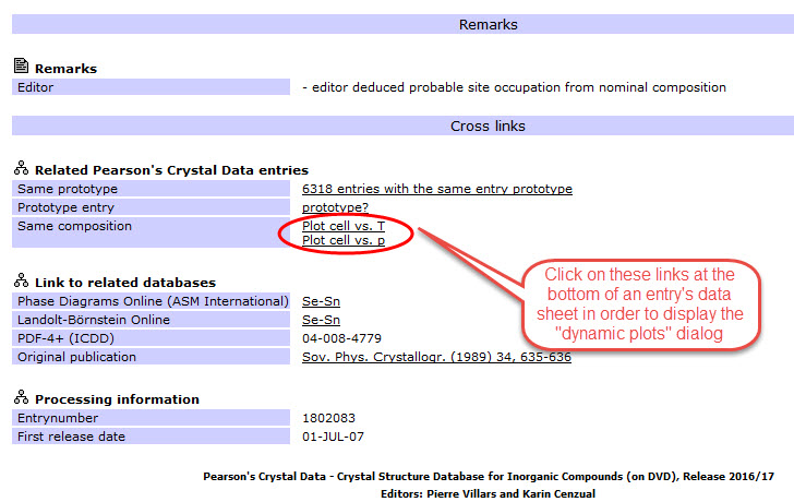
The links Plot cell vs. T and Plot cell vs. p are located in the Related Pearsons Crystal Data
entries subsection in the Cross links section close to the bottom of the data sheet:
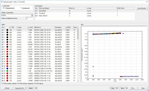
When the user clicks on one of these links, the software internally searches for all entries that share
the same composition (in atom %) with the entry for which the data sheet is displayed, and for which
plot data are available. Afterwards, the so-called Dynamic plot dialog is displayed.
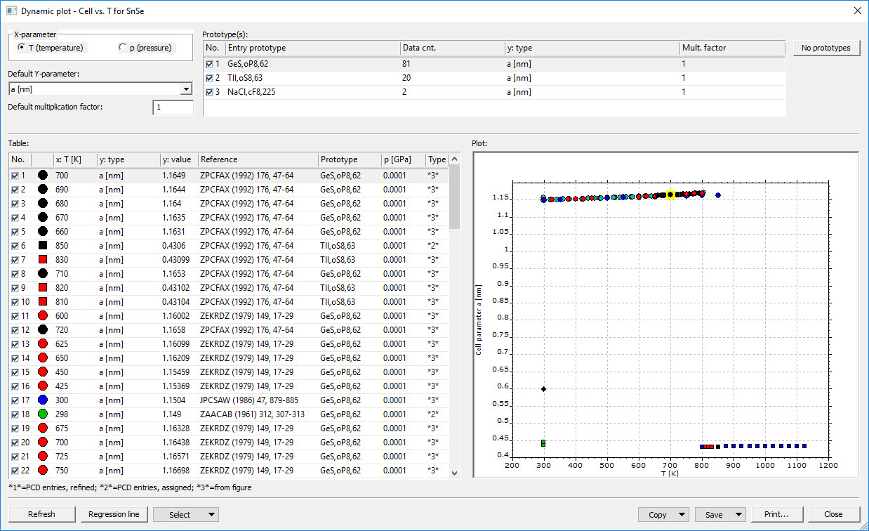
As an example, here is the plot dialog created from the data sheet of entry no. 1802083 (SeSn):
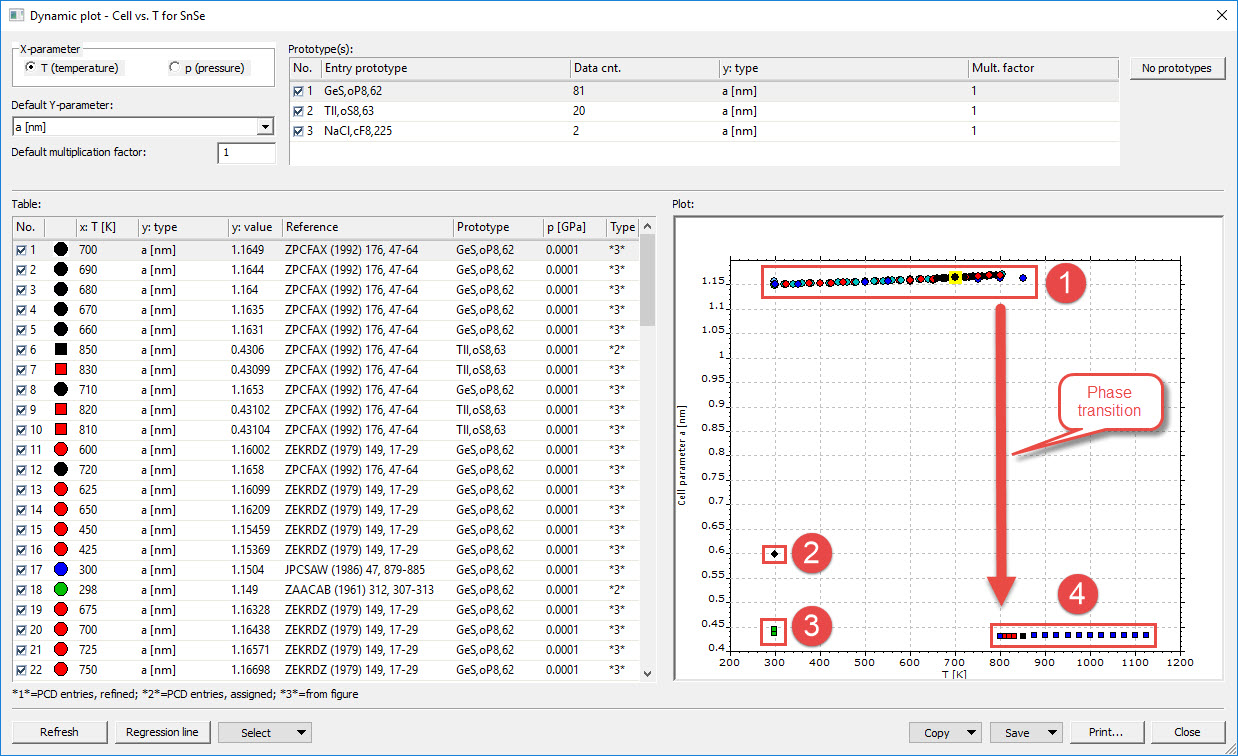
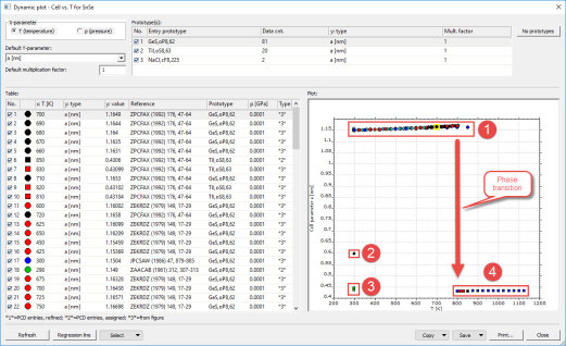
If you take a closer look at the plot on the right-hand side of the table in this example, there seem to
be at least four groups of entries in the plot (see figure below), each of them being possibly related to a certain
structure or phase. The step at T = 800 K could be a sign for a phase transition of the compound
SeSn at this temperature.
By marking (clicking on) the symbols in the plot, you can mark the corresponding lines in the table to
its left (and vice versa). In this table, the various sources (references) of the plot data are given, along
with their plot coordinates (values of x- and y-values), the prototype of the corresponding compounds
and the source type for the information given. Finally, you can enable or disable the displaying of
individual data points by marking or unmarking the checkboxes in the left-most column of the table.
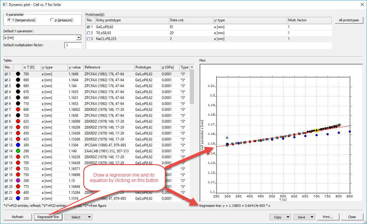
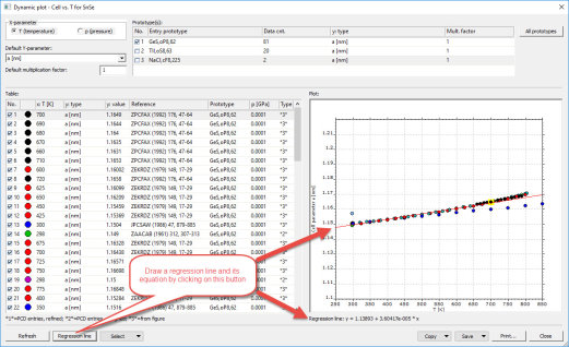
You can display a regression line through the data points displayed in the plot, along with its equation,
by clicking on the corresponding button in the bottom left corner of the Dynamic plot dialog:
In addition to the main table and the plot, there are several more dialog elements using which the
plot can be modified:
At the top left of the dialog window, you can select which type of information (either temperature or
pressure) you would like to display on the x-axis of the plot. Below, you can select which information
(e.g. unit cell parameter) you would like to display on the y-axis. In addition, a multiplication factor
for all data points (Default multiplication factor) is available. To its right there is a table where
you can mark the entry prototype(s) for which you would like to include data in the plot, using
the corresponding checkboxes in the column No.. In this table, you can also modify the type of
information you would like to display on the y-axis, separately for each entry prototype (line), as
well as the corresponding multiplication factor.
Furthermore, you can modify the x- or y-parameter values of individual data points, simply by
clicking in the corresponding line and column of the main table on the left hand side, and entering
the new value.
Commands for copying, saving or printing the plot or table are available at the bottom right of the dialog.
Features overview
Previous: All views at a glance
Next: Figure plots
|